I also try to be a weekly geek (I mean, I do geek out daily in my own special way) but I never seem to get around to it.
BUT! HA! Better late than never, right? This week we're talking
book covers. I'm going to talk about consistency within a series. I'm a big fan of consistency. I like the books on my shelf to match and am not happy when a series changes look half way through. I mean, read my rants
here and
here about the
Confessions of Georgia Nicolson series.
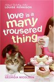
And Georgia's where I'm going to start, because I wasn't originally a fan of the new covers. When I started reading, the covers all looked like this:


But, when
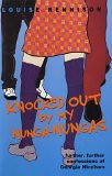
Then He Ate My Boy Entrancers went to paperback, they changed cover designs. Now the first 4 books (pictured above) look like this:


Now, it's been a few years, and the new covers are starting to grow on me. I like that they incorporate Angus (the cat) on every cover, because he is a big part of every book. I especially like the new cover for
Dancing in My Nuddy-Pants, because the romantic shadow on the wall is that of two cats. It's subtle and funny once you read the book (although the old cover, check out the man in the moon--it's two kissing cats!) I miss the old covers, but I do think the new ones will appeal to more teens today. I still, however, insist that those nunga nungas would not knock anyone out.
Despite my fuddy-duddy DON'T CHANGE THE BOOK COVER ways, sometimes it's necessary. I've been reading the
Alice books by Phyllis Reynolds Naylor (expect a big review this weekend or next week.)
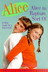
Now, Naylor started writing the Alice books in the mid-80s and the series is ongoing. The old covers needed to go. However, they then changed the covers
again and the newest ones are fine, but the older ones are still good. Here's the progression for
Alice in Rapture, Sort Of.


And! Some of the newer titles/those featuring an older Alice, have totally different covers! (I'm judging entire remakes based on the "Alice" logo, which is consistent across books, but changes when they redesign the overall package)
Now, these two versions of
Including Alice are pretty similar, to the point where I think both pictures were taken in the same photoshoot--the model is wearing the same top! But, I think they're both paperbacks...:


There's a bigger difference between these two paperback versions of
Alice in April

And a really big difference between these two paperback versions of


The big thing I can see with the newer editions of the Alice books is that each cover seems to look like it's for an older audience than the older cover. I'm wondering why this is. Alice has always been a very controversial series (Alice thinks about sex a lot. Not that she wants to have a lot of it, but just that's she's naturally very curious about this thing that no one talks about.) So, are the publishers trying to push it into older hands by making the covers look older?
Or is it because kids like to read "up"--reading about characters older than they are and books that look older. So are the publishers aging up the covers so that the kids who are Alice's age (she ages a year every 3 books) won't think they're too babyish based on the cover?
Also, some of the covers needed to change. The illustrated version of
Alice in Rapture, Sort of needed to go. But the middle one is the right age for Alice. The newer one of the heart in the beach, while technically age ambiguous, makes it feel like it's for a much older reader. The newer version of
Simply Alice looks more like how old Alice should be. She's 15 and a sophomore in high school in that book--the older one just looks too young. On the other hand, the newer
Alice in April might be too old, as the older one (where you can see her face) looks about the right age.
What are your thoughts?